在 Umi 中使用
在 Umi 中使用
 Ant Design X
在真实项目开发中,除了 Ant Design X 这样的 UI 库,你可能会还会需要构建工具、路由方案、CSS 方案、数据流方案、请求库和请求方案、国际化方案、权限方案、Icons 方案等等,才能完成一个完整的项目。我们基于业务场景,推出了基于 React 的企业级应用框架 Umi,推荐你在项目中使用。
Umi,中文发音为「乌米」,是可扩展的企业级前端应用框架,也是蚂蚁集团的底层前端框架,已直接或间接地服务了 10000+ 应用。Umi 以路由为基础,同时支持配置式路由和约定式路由,保证路由的功能完备,并以此进行功能扩展。然后配以生命周期完善的插件体系,覆盖从源码到构建产物的每个生命周期,支持各种功能扩展和业务需求。
本文会引导你使用 Umi、Ant Design X 从 0 开始创建一个简单应用。
推荐使用 pnpm 创建 Umi 脚手架,执行以下命令。
$ mkdir myapp && cd myapp$ pnpm create umi
如果你使用 npm,可执行
npm create umi,效果一致;如果你使用 yarn,可执行yarn create umi,效果也一致;如果你使用 bun,那说明你是个非常潮的人,可执行bunx create-umi(注意,create和umi之间有个-)。
这里选「Simple App」,因为我们要从 “0” 开始。
? Pick Umi App Template › - Use arrow-keys. Return to submit.❯ Simple AppAnt Design ProVue Simple App
这里建议选「pnpm」,pnpm 在速度以及处理幽灵依赖方面都更有优势。
? Pick Npm Client › - Use arrow-keys. Return to submit.npmcnpmtnpmyarn❯ pnpm
这里国内的朋友建议选「taobao」,否则选「npm」。选择 npm taobao 源在安装依赖时通常会更快一些。
? Pick Npm Registry › - Use arrow-keys. Return to submit.npm❯ taobao
然后工具会自动安装依赖,并执行 Umi 的初始化脚本。
在启动项目之前,我们再安装一些本教程会用到的依赖。
$ pnpm i @umijs/plugins -D$ pnpm i @ant-design/x -S
其中 @umijs/plugins 是 Umi 的官方插件集,包含了 valtio、react-query、styled-components、locale、access、qiankun 等大量插件,可让用户通过配置的方式一键开启和使用;
完成后,执行以下命令启动项目。
$ npm run devumi devinfo - Umi v4.0.46╔════════════════════════════════════════════════════╗║ App listening at: ║║ > Local: http://localhost:8000 ║ready - ║ > Network: http://*********:8000 ║║ ║║ Now you can open browser with the above addresses↑ ║╚════════════════════════════════════════════════════╝
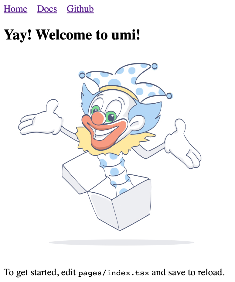
跟着提示点击命令行里的 url,会自动打开浏览器。如果顺利,你会看到如下界面。
我们要写个应用来先显示产品列表。首先第一步是创建路由,路由可以想象成是组成应用的不同页面。Umi 用户通常不需要关心 Umi 背后的实现,但如果你想知道,Umi 的路由是基于 react-router@6.3 实现(注:不是最新的 6.4,6.4 包含的 loader 和 action 功能并不是 Umi 所需要的)。
我们通过命令即可创建路由。
$ npx umi g page productsWrite: src/pages/products.tsxWrite: src/pages/products.less
然后修改配置文件 .umirc.ts 加上新增的路由声明。
import { defineConfig } from "umi";export default defineConfig({routes: [{ path: "/", component: "index" },{ path: "/docs", component: "docs" },+ { path: "/products", component: "products" },],npmClient: "pnpm",});
由于脚手架默认使用的是配置式路由,顾名思义,就是路由是自己一行行配出来的,虽然繁琐,但灵活性更高,这种方式需要在配置里加上 routes 字段,详见 Umi 文档之路由。此外,Umi 还支持约定式路由,意思是文件系统即路由,所以无需配置路由即可生效。
然后我们编辑下 src/layouts/index.tsx 文件,在全局布局路由里加上到 /products 路径的导航。
<li><Link to="/docs">Docs</Link></li>+ <li>+ <Link to="/products">Products</Link>+ </li>
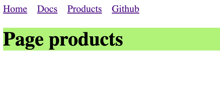
打开 http://localhost:8000/products ,如果顺利,你会看到如下页面。
随着应用的发展,你会需要在多个页面分享 UI 元素(或在一个页面使用多次),在 Umi 里你可以把这部分抽成 component 。我们来编写一个 ProductList 组件,这样就能在不同的地方显示产品列表了。
新建 src/components/ProductList.tsx 文件,内容如下。
import React from 'react';import {XProvider,Bubble,Sender,Conversations,Prompts,Suggestion,ThoughtChain,} from '@ant-design/x';import { Flex, Divider, Radio, Card, Typography } from 'antd';import type { ConfigProviderProps, GetProp } from 'antd';import {AlipayCircleOutlined,BulbOutlined,GithubOutlined,SmileOutlined,UserOutlined,} from '@ant-design/icons';export default () => {const [value, setValue] = React.useState('');const [direction, setDirection] =React.useState<GetProp<ConfigProviderProps, 'direction'>>('ltr');return (<><Flex gap={12} style={{ marginBottom: 16 }} align="center"><Typography.Text>Direction:</Typography.Text><Radio.Group value={direction} onChange={(e) => setDirection(e.target.value)}><Radio.Button value="ltr">LTR</Radio.Button><Radio.Button value="rtl">RTL</Radio.Button></Radio.Group></Flex><Card><XProvider direction={direction}><Flex style={{ height: 500 }} gap={12}><Conversationsstyle={{ width: 200 }}defaultActiveKey="1"items={[{key: '1',label: 'Conversation - 1',icon: <GithubOutlined />,},{key: '2',label: 'Conversation - 2',icon: <AlipayCircleOutlined />,},]}/><Divider type="vertical" style={{ height: '100%' }} /><Flex vertical style={{ flex: 1 }} gap={8}><Bubble.Liststyle={{ flex: 1 }}items={[{key: '1',placement: 'end',content: 'Hello Ant Design X!',components: { avatar: <UserOutlined /> },},{key: '2',content: 'Hello World!',},]}/><Promptsitems={[{key: '1',icon: <BulbOutlined style={{ color: '#FFD700' }} />,label: 'Ignite Your Creativity',},{key: '2',icon: <SmileOutlined style={{ color: '#52C41A' }} />,label: 'Tell me a Joke',},]}/><Suggestion items={[{ label: 'Write a report', value: 'report' }]}>{({ onTrigger, onKeyDown }) => {return (<Sendervalue={value}onChange={(nextVal) => {if (nextVal === '/') {onTrigger();} else if (!nextVal) {onTrigger(false);}setValue(nextVal);}}onKeyDown={onKeyDown}placeholder='Type "/" to trigger suggestion'/>);}}</Suggestion></Flex></Flex><ThoughtChain /></XProvider></Card></>);};
完成开发并且在开发环境验证之后,就需要部署给我们的用户了,执行以下命令。
$ npm run buildinfo - Umi v4.0.46✔ WebpackCompiled successfully in 5.31sinfo - File sizes after gzip:122.45 kB dist/umi.js575 B dist/src__pages__products.async.js312 B dist/src__pages__index.async.js291 B dist/layouts__index.async.js100 B dist/layouts__index.chunk.css55 B dist/src__pages__products.chunk.cssevent - Build index.html
构建会打包所有的资源,包含 JavaScript, CSS, Web Fonts, 图片, HTML 等。你可以在 dist/ 目录下找到这些文件。
我们已经完成了一个简单应用,你可能还有很多疑问,比如:
你可以: